
Between 2000 and 2008, a widespread deep loathing of George W. Bush now known as Bush Derangement Syndrome grew to such a fever pitch that it threatened to tear the country apart. Political analysts — at least those who weren’t BDS sufferers themselves — were astonished to observe what seemed to be an unprecedented level of not just political vitriol but personal hatred directed at Bush and his view of the world.
Bush Derangement Syndrome was described as unprecedented in American history. But was it really? A recent find throws that supposition into doubt.
Reagan Derangement Syndrome?
At a garage sale not too long ago, I bought for 50¢ a tattered poster entitled “The World According to Ronald Reagan.” Judging from the historical clues of locales emphasized in the map (Grenada, Beirut, The Falklands) the poster appears to have been made at the end of 1983 or early 1984, and possibly was sold in connection with the 1984 presidential election. Here’s what it looks like:

What’s remarkable about this map is how little has changed in the 25 years since it was made. True, a few of the geo-political features are now out-of-date, but the overall point of view remains the same.
The map — obviously designed by a leftist and/or a Democrat — purports to be a clever parody of the Republican mindset, but we can in retrospect now see that the map is not so much an insight into Reagan’s world but rather a peek into what the leftists imagined Reagan thought. As a result, the map serves to illuminate the leftist worldview of the time, filtered through a parodic lens. Think of the map as an archaeological document that reveals the unconscious biases of its creators.
Let’s take a closer look at the portion of the map which depicted the leftist version of Reagan’s America:

The first detail that jumps out at you is how similar this map is to the well-known “Jesusland” map that emerged after the 2004 election, highlighting the geopolitical divide between Bush supporters and detractors. In this version, the area later dubbed Jesusland is instead labeled “Republicans and other real Americans.”
Of course, if the map truly reflected the right-wing worldview, then California and New England would be especially small (to reflect their ideological unimportance), whereas “real America” would be greatly enlarged; this map shows the exact reverse, with California bigger than the rest of the country all combined, thereby revealing the political bias of the mapmakers, not of Reagan.
“Ecotopia,” in the Pacific Northwest, is a reference to a 1970’s novel of the same name which visualized the Pacific coast as an autonomous utopian commune, hewing to hippie values and separate from the rest of America. Though now largely forgotten, in 1983 Ecotopia was still widely enough known to be used as the the name of the place where all the “environmental freaks and quiche eaters” live.
Because of Reagan’s stance as an anti-communist hawk, Central America and the Caribbean are simplified to show only those areas with relevance to the Cold War in the early 1980s — the Salvadoran civil war, the invasion of Grenada, and Castro’s Cuba. But a notable difference between then and now is that Mexico is given essentially no relevance whatsoever, being relegated to “Mariachiland.” If the map had been made today, there undoubtedly would have been some reference to Mexico as the source of most illegal immigrants to the U.S.
The other half of the map is even more interesting. Here’s a detailed close-up:
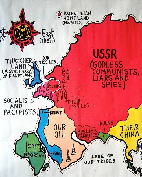
Even 25 years ago, there were two primary areas of focus: the struggle between capitalism and communism/socialism (with the left favoring communism), and the Middle East (with the left favoring the Palestinians over Israel and also obsessing over oil). Of course, the mapmakers never imagined someone would ever come to this conclusion just from looking at their parody.
This portion of the map reveals a behind-the-scenes struggle to control the narrative which had already started back then and which still continues essentially unchanged to this day: The “right” identifies foes of the Western world (communism and Islamic extremism) and the “left” responds by satirically mocking the very notion of there being evil villains out to get us (by sarcastically calling the USSR “Godless communists, liars and spies,” and by laughing at the fear of Islamic extremists by labelling them “Muslim fanatics”). In the 21st century the left still dismisses fears of “Muslim fanatics” as paranoiac warmongering, and still mocks anyone who is anti-communist or anti-socialist.
Or course, with the benefit of more historical hindsight we now know that the leftist tactic of pooh-poohing the very notion of there being a struggle against “the bad guys” is simply a clever way of sidestepping being perceived as siding with those very same bad guys. The dynamic goes like this: The pro-America right posits an us-vs.-them framework, such as “We are freedom-loving pro-democracy capitalists; those bad guys are freedom-hating anti-democratic communists/Islamists/etc. We conservatives choose the side of freedom; what side do you choose?” Now, many on the far left do side with the enemies of capitalism; but strategically, they don’t want to be identified as such. So, in response to this framework, instead of taking sides in a good-vs.-evil narrative which they can’t win, they try to demolish the whole framework altogether. Hence, as in this map, they mock the very notion that there is a good-vs.-evil struggle going on, and portray it as the sad violent fantasy of a Reaganite right-wing which can’t comprend the shades of gray.
But were the USSR and “Muslim fanatics” (most likely referring to Ayatollah Khomeini and the Iranian Revolution) imaginary bogeymen concocted by the right to justify their warmongering, as the leftist mapmakers would have us believe? Or were they real threats after all? I know what I think — what do you think?
Perhaps the most surprising aspect of the map is the inflated focus on the Israel/Palestinian conflict. Western Europe is barely even depicted, and is not named, whereas by comparison Israel is shown as being immense (its depicted size mirroring its psychological significance rather than its geographical dimensions), while a tiny dot in the Arctic Sea is identified as being the “Palestinian Homeland (proposed).” I never realized just how long ago the left had switched allegiances and fully embraced the Palestinian view.
Israel is so big in this rendition that it’s actually larger than the entire Muslim world — while actual maps show the situation is quite the opposite. (And why is Beirut shown as being inside Israel?)
For the last decade, the left has focused almost obsessively on oil, claiming that the Iraq War and the entire “war on terror” were done simply to garner oil profits for Bush’s cronies. Oil is also now seen as the virtual lifeblood of evil capitalism, a symbol of everything the left hates. But I didn’t realize how far back this approach went: oil is the only commodity mentioned anywhere on the map (“Our oil” on Saudi Arabia and offshore drilling next to California).
Another map detail shows a tactic which is still commonly used today: to suggest that the right is inherently racist, without any evidence to back up the accusation. In this case, all of Africa is dismissed (remember this is a leftist fantasy of how the right thinks) as “Negroes,” while India is filled with “Injuns.” Yet Reagan never did or said anything that could be interpreted as racist. The exact same accusations were leveled at Bush, with a corresponding lack of evidence.
“Derangement Syndrome” is not unique to the Bush era. Many on the left had a visceral hatred for Reagan, and (a decade earlier) for Nixon as well. Looking at this map is like looking at a mirror reflecting another mirror reflecting another mirror in which, somewhere in the distance, one can see the early-’80s leftist worldview — a worldview which bears a startling resemblance to the worldview the left still holds to this day.
(Analyses, rebuttals and other observations about “The World According to Ronald Reagan” can be posted in the comments section below.)
138 Responses to “The World According to Ronald Reagan: Analysis of a 1980s political poster, as seen through modern eyes”